Melina from 123 Get Scrappy! has put up a new challenge grid for all of us to play. Here it is:
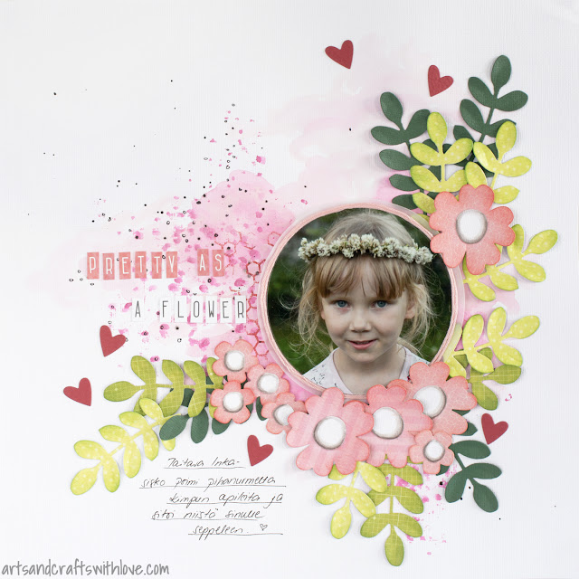
It could be that the upcoming Mother's day made me use a lovely picture of my sweet daughter, and combine it with girly pink and green colours, lots of die-cut flowers and hearts ♥. Here's my layout, for which I used the diagonal row Die cut piece - Lots of flowers - Circle shaped photo:
For the background I used plain white cardstock with pink watercolors. Without a contrasting color I thought the result would have been too soft and boring, and I added a hint of black with splashing black watercolor on the background. However, as the background was not treated with gesso nor anything similar, the black water color started fading and blending into the background. That's not the result I was after! I changed to a black marker, and doodled small circles and dots on the pink color. Better!
The lovely flowers, leaves and tiny hearts are die-cut using new dies from Sizzix Craft Asylum collection. The sets are called 'Woodland Flower' and 'Woodland Leaves', follow the links to see what shapes the die sets contain!
Before attaching the flowers and leaves on the layout I inked their edges and bent the petals ownward. I don't usually crate too 3-dimensional layouts, as I don't know how to store them. Layering the elements and shaping the paper embellishments usually are enough for having a 3-D effect on my project.
For shaping the photo I used the Sizzix circle die. For protecting the photo during cutting I placed a piece of printing paper between the photo and the cutting plate; that way you can use also the most worn-out cutting plates for die-cutting photos. I also cut another circle from vellum and placed it underneath the photo. The pink frame is made from emroidery yarn.
The flower center pieces are die-cut from white cardstock. As a finishing touch I shaded the edges with grey markers.
Wishing you all happy Mother's day!


love it! what a great page...
ReplyDeleteI love this layout, Elina!! Especially that touch of watercolour in the background! You are so clever!! :)
ReplyDelete